
Introduction
“Generation rent” is an oft-used term to describe the woes of millennials when it comes to purchasing property. It is a global phenomenon driven by very fast rises in asset values over the last 50 years resulting in a perceived hoarding of wealth by previous generations.
Like other assets, property values have risen hugely and are more emotive as they constitute both an asset and a home. It is worth pointing out that the rise in asset values was driven by a massive rise in productivity and wage growth over the period so if previous generations are hoarding wealth, there is at least some argument that they might have earned it!
In a previous version of this blog, we looked at London Rental Prices in the decade between 2010 and 2020, and then again in an update in early 2023 after Covid and a year of the Ukraine war.
Both of these blogs are available here:
London Rent Prices Over the Last Decade to 2020
London Rental Prices Over the Last Decade 2023
Rental Prices in London since Feb 2010
Since 2010, the average London rental value has risen by 83%, an average increase of 5.5% per year.
Figure 1 shows how this average rental value changed over the last 15 years.
Between 2010 and mid 2016, prices rose steadily, peaking at about a 40% increase over the 6 years.
In mid-2016, Britain voted to leave the European Union. Rental prices dipped in the aftermath of the vote before slowly recovering by early 2020 and the start of Covid. They fell for a year until early 2021 and then began a strong recovery, increasing by 35% between early 2021 and the end of 2024.

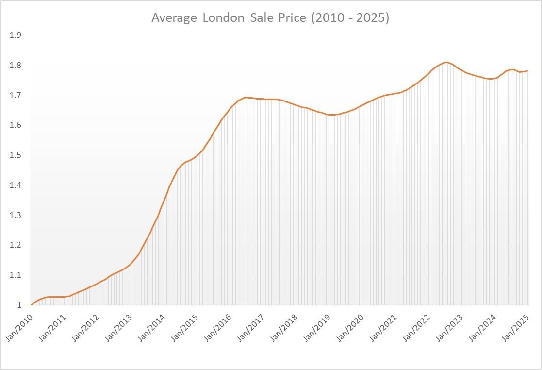
Sale Prices in London since Feb 2010
Since 2010, the average London sale value has risen by 78% amounting to an average of 5.2% per annum.
Figure 2 shows how this average sale price changed between 2010 and 2025.
In 2010, buoyed by newly cheap credit, the sales market bounced out of the Global Financial Crash with a bang and grew quickly for 6 years until Brexit when it leveled off and began a slow decline through several years of political uncertainty.
From early 2019 the market began to recover and remarkably continued to grow through the Covid years although there was a marked change in the types of properties being bought, which we discuss in A New Approach to House Price Indices.
The recent high point of the market was in July and August 2022. In September 2022, the Liz Truss Conservative Government proposed a new budget containing large unfunded tax cuts in the context of wider global issues due the Covid hangover and the Ukraine war. This budget caused investor confidence in the UK to collapse.
The cost of borrowing for the state shot up, causing interest rates to rise quickly, thus ending 13.5 years of ultra-cheap credit. (see Figure 3)
Since September 2022 the average sale price in London has fallen by 1.6%

How do all these figures affect supply and pricing in the rental market?
In our previous article, about Rental Yields and Interest Rates, we discussed how Sales Pricing, Rental Pricing, Cost of Borrowing and Government Regulation and Policy form an inter-connected system which directly affect both the availability of rental stock and its price.
We came to the conclusion that measures to cool the rental market were more likely to drive private money out of the market, thereby increasing supply issues and therefore the average cost of renting.
Taken to its logical conclusion, this would lead to the Government having to build and manage all the rental stock in the UK! - not a prospect even the most red of Governments would relish.
Affordability of property
Both Figures 1 and 2 plot the average change in property values in terms of British pounds. However, the British pound does not have the same value now as it did 15 years ago and average workers earn a lot more pounds (approximately 60% more) today for a week of work than they did in 2010. Thankfully the Office of National Statistics tells us exactly how much the average wage has increased over time which we have plotted in Figure 4.
Source:
Office of National Statistics - Average Weekly Earnings, Whole Economy Index: Seasonally Adjusted Regular Pay Excluding Arrears.

London Rental Prices relative to how much people earn
Using the data on average weekly earnings from the Office of National Statistics, we can rebase the Rental Prices to look at them in terms of how much people earn, otherwise known as affordability.
In Figure 5, the orange line is the absolute change in rental pricing (also Figure 1), but the blue line is the rental price change in terms of average incomes.
We can see that the most unaffordable period was in early 2016 with rental values at 20% higher relative to 2010. While rental prices increased dramatically from 2022 onward, wage growth also increased, reducing the effect.
In these real terms, rental prices are currently about 15% more expensive relative to average income than early 2010.

London Sales values relative to how much people earn
Performing the same analysis on the sales market shows that much like the rental market, buying property reached a peak of un-affordability just before the Brexit vote and has been steadily improving since then.
Unlike the rental market however, the sales market also depends on mortgage rates and since 2022 those rates have jumped from 0.5% to 5.25%.
This means a property valued at £250,000 could have cost you as low as £110 per month on an interest only basis in 2022 was suddenly costing over £1000 per month in 2023 on the same terms.
Clearly this has a huge effect on affordability quite aside from the wage to value ratio.

Conclusion
London property, whether for sale or to let, became very expensive on a relative basis in the years prior to the Brexit vote. Despite all the other headwinds in the markets such as Covid, Government change, European War and Crazy Budgets, Brexit remains the biggest driver of market change in London.
Markets broadly approximate aggregate expectations for the future and it is clear that in London at least, expectations were greatly damped the day after the vote. This is probably not surprising given London voted clearly to remain in the European Union.
You can keep an eye on all the changing sales and rental values across England and Wales at Bricks&logic.
Data Appendix
The table below contains an annual average of the data used in this blog.
The Sale and Rental index data are from proprietary Bricks&Logic analysis. The Weekly Earnings index is from the Office of National Statistics and the Average Base Rate index is produced from raw data from the Bank of England.
| YEAR | SALE INDEX | RENT INDEX | WEEKLY EARNINGS | BASE RATE |
| 2010 | 1.02 | 1.03 | 1.01 | 0.50 |
| 2011 | 1.05 | 1.10 | 1.03 | 0.50 |
| 2012 | 1.10 | 1.16 | 1.04 | 0.50 |
| 2013 | 1.22 | 1.21 | 1.05 | 0.50 |
| 2014 | 1.44 | 1.27 | 1.06 | 0.50 |
| 2015 | 1.57 | 1.33 | 1.09 | 0.50 |
| 2016 | 1.68 | 1.35 | 1.11 | 0.40 |
| 2017 | 1.68 | 1.32 | 1.14 | 0.29 |
| 2018 | 1.65 | 1.32 | 1.17 | 0.60 |
| 2019 | 1.64 | 1.35 | 1.21 | 0.75 |
| 2020 | 1.69 | 1.37 | 1.24 | 0.33 |
| 2021 | 1.73 | 1.38 | 1.30 | 0.25 |
| 2022 | 1.80 | 1.53 | 1.37 | 1.54 |
| 2023 | 1.77 | 1.69 | 1.47 | 4.73 |
| 2024 | 1.78 | 1.80 | 1.55 | 5.10 |
| 2025 | 1.78 | 1.83 | 1.60 | 4.75 |


